Case Study: Ari Abel Counselling
Client Background
Ari Abel Counselling is a psychotherapy and coaching practice focused on helping individuals better understand themselves and navigate life’s challenges. The practice emphasizes perspective, personal growth, and creating a supportive, accessible space for clients.
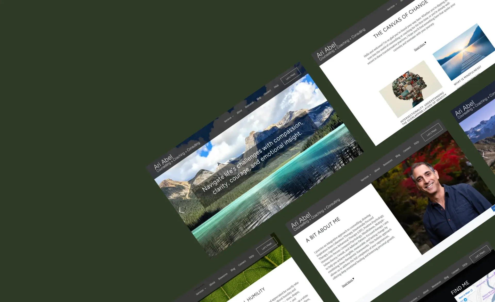
The client required a complete digital presence including branding refinement, UX/UI design, and a custom WordPress website that would feel calm, professional, and easy to navigate.
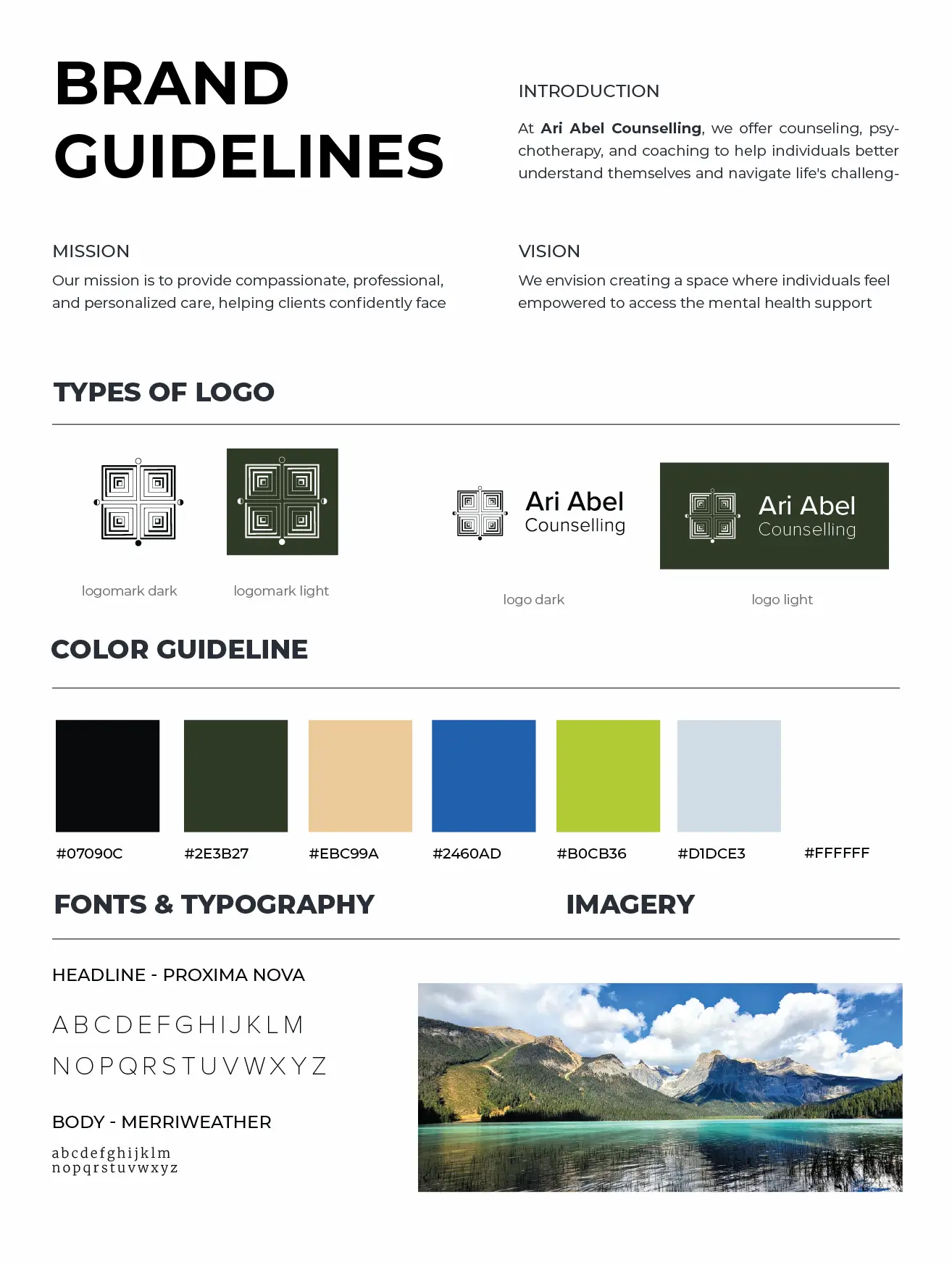
A key aspect of the project was integrating a hand-drawn geometric logo concept provided by the client, which held strong personal meaning and needed to be preserved.
Project Goals
Develop a modern, user-friendly website aligned with the client’s therapeutic approach.
Create a calm, uncluttered UX that encourages trust and conversion.
Support key user actions such as booking sessions and accessing resources.
Refine and digitize the client’s existing hand-drawn logo for digital use.
Ensure accessibility, responsiveness, and strong SEO foundations.
Scope of Work
As outlined in the project agreement:
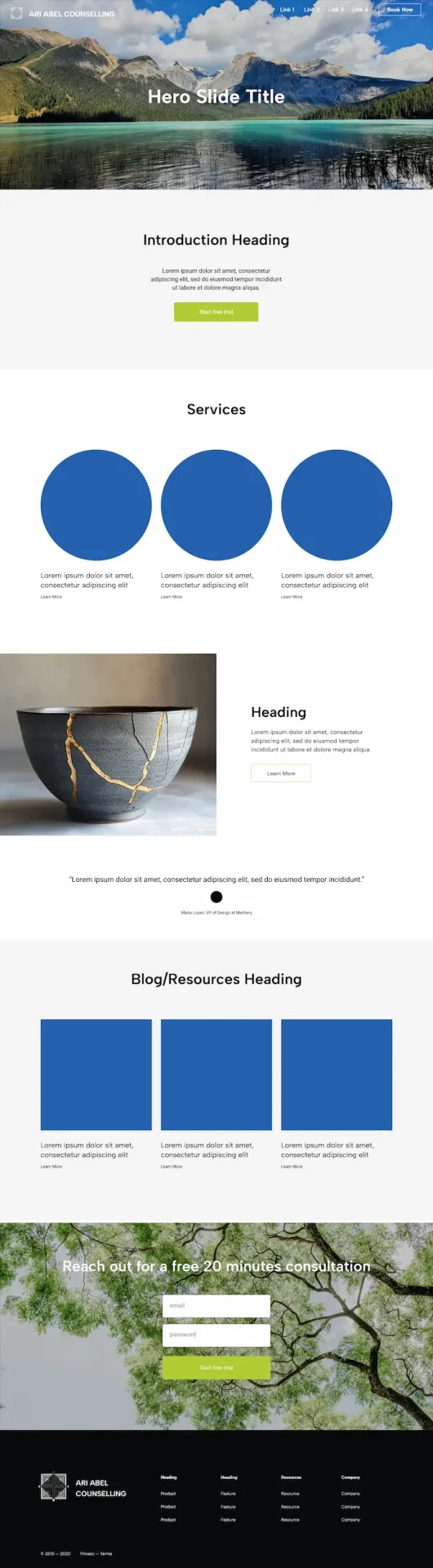
Custom WordPress website (~5 pages)
UX/UI design and layout system
Logo digitization and brand refinement
Contact form + booking integration (Jane App)
Basic SEO setup and performance optimization
Responsive development and cross-browser testing
Website launch and post-launch support
Branding & Logo Development
The client provided a hand-drawn geometric sketch representing themes of perspective and layered understanding.
While simplification was recommended to improve clarity and scalability (particularly for mobile and small-screen use), the client had a strong preference to retain the original structure and meaning of the design.
Approach
The logo was:
- Digitized for clarity and consistency
- Balanced for spacing and symmetry
- Adapted into light and dark variations
- Integrated into a flexible layout system
This approach ensured the logo maintained its conceptual integrity while functioning across digital applications.
UX/UI Design
The UX strategy focused on reducing friction and guiding users toward key actions:
- Book a session
- Learn about the practitioner
- Access resources
Based on the client questionnaire, the site needed to feel:
- Clean and organized
- Calm yet positive
- Easy to navigate
- Inviting and trustworthy
Key UX Decisions
- Clear call-to-action placement throughout the site
- Minimal, distraction-free layouts
- Structured content hierarchy for readability
- Accessible navigation across all devices
- Balanced use of whitespace and color
Design & Development
The website was built using a custom WordPress setup, allowing for flexibility and ease of content management.
Design System
- Neutral base palette with grounded greens and soft accents
- Clean typography pairing (Proxima Nova + Merriweather)
- Consistent spacing and modular layout structure
Development Highlights
- Fully responsive across desktop, tablet, and mobile
- SEO-friendly structure and metadata implementation
- Performance optimization (image compression, caching)
- Cross-browser compatibility testing
- Integrated contact and booking workflows
A structured launch and maintenance process ensured stability, security, and long-term usability.
Results
Delivered a fully responsive, user-friendly website aligned with the client’s vision and practice.
Successfully translated a conceptual hand-drawn logo into a functional digital asset.
Improved clarity of user journeys, supporting increased booking actions.
Created a scalable WordPress system for ongoing content updates.
Established a strong foundation for SEO, performance, and future growth.
Credits
UX/UI Design: Riley I Design
Web Development: Riley I Design
Branding & Logo Digitization: Riley I Design


