Case Study: Watershed Productions
Client Background
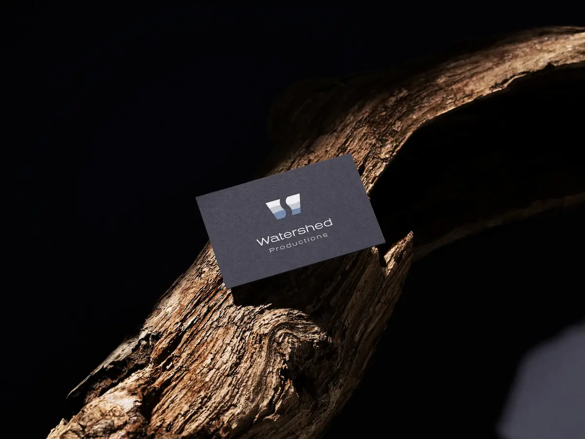
Watershed Productions is a media and production company focused on storytelling, visual content, and creative direction. They required a distinctive brand identity that could reflect both the fluid, natural concept of a “watershed” and the precision and professionalism of a production studio.
The goal was to create a logo system that felt modern, cinematic, and versatile across digital and physical applications.
Project Goals
Develop a strong, recognizable logo mark rooted in the concept of flow and division.
Create a flexible logo system that works across multiple formats (horizontal, vertical, icon).
Establish a refined, modern visual identity using a minimal and cinematic colour palette.
Ensure scalability for use across web, video, social media, and production assets.
Scope of Work
As outlined in the project:
Primary logo design (wordmark + symbol)
Logo variations (horizontal, vertical, logomark)
Colour palette development
Typography selection and hierarchy
Brand guidelines for consistent usage
Design Direction
The identity is built around the concept of a watershed — a point of division where water flows in different directions. This idea is translated visually into a minimal, abstract symbol that suggests:
- Flow and movement
- Duality and separation
- Natural forms shaped by water
The mark uses soft curves and layered shapes to create a subtle sense of depth, echoing landscapes and water gradients without being literal.
The overall aesthetic balances:
- Cinematic minimalism
- Natural inspiration
- Modern precision
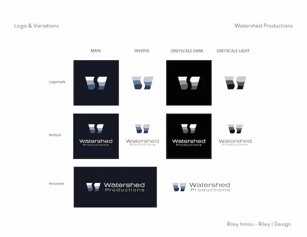
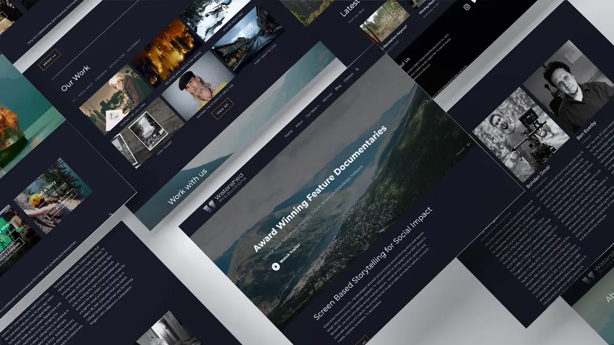
Logo System
The logo system was designed for flexibility across use cases.
Logomark
- Abstract “W” form derived from flowing shapes
- Works as a standalone icon for social, video watermarking, and favicons
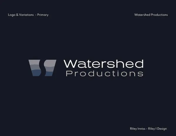
Primary Logo
- Combination of logomark + wordmark
- Clean, modern typography for clarity and professionalism
Variations
- Vertical lockup for stacked applications
- Horizontal lockup for web headers and widescreen formats
- Inverse and grayscale versions for different backgrounds
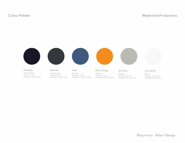
Colour Palette
The palette reflects a balance between natural tones and digital contrast:
- Midnight – deep, cinematic base colour
- Dusk – muted blue for depth and softness
- Dark Ash – grounding neutral
- Dark Orange – strategic accent for energy and contrast
- Ash Grey / Lynx White – supporting neutrals
This system allows the brand to feel both moody and refined, with controlled moments of vibrancy.
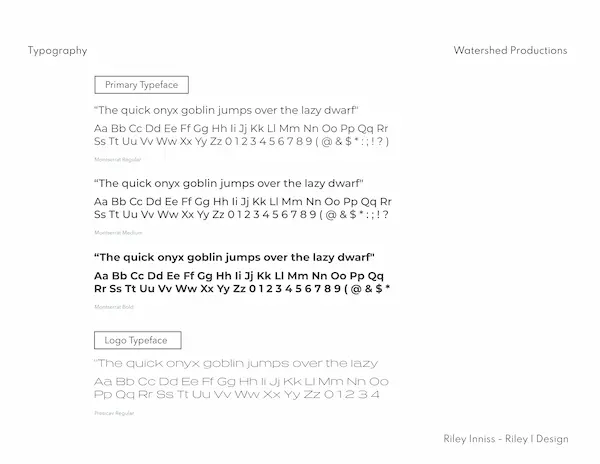
Typography
Primary Typeface: Montserrat
- Clean, modern, highly legible
- Used across digital and brand applications
Logo Typeface: Priscav
- Distinctive and minimal
- Adds subtle personality without overpowering the mark
Typography was selected to maintain:
- Clarity in production contexts
- Strong hierarchy across media
- A contemporary, editorial feel
Design Outcome
Delivered a cohesive and scalable brand identity for Watershed Productions.
Created a versatile logo system adaptable across digital, print, and video.
Established a clear visual language through colour and typography.
Provided brand assets and guidelines for consistent future use.
Credits
Logo Design + Brand: Riley I Design

")


